mail.ru
Social Media
2020
Show typography not as styling, but as a core UX tool for information hierarchy and credibility.

Design history has long searched for universal rules of harmony. The Bauhaus and De Stijl set the foundation, while the Swiss School turned it into a system of grids, hierarchies, and proportions.
Today, these principles remain visible in digital media — from The Guardian to The New York Times. But where print layouts were static, digital products must adapt dynamically to user flow.
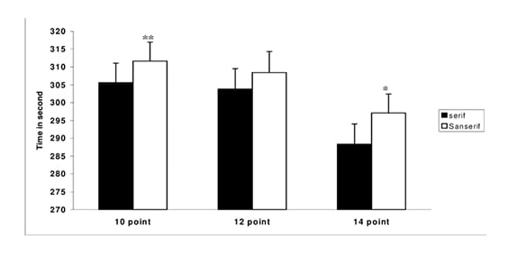
A 2011 study by Banerjee & Majumdar showed: humanist sans-serifs at 14 pt reduce cognitive load and ensure faster reading times.
Insight: humanist sans-serifs are optimal for body text in digital news products.

Cognitive load for 14pt font
1.83 ± 0.15 sec

Larger font size impacts user perception
Fastest reading time: Courier New 14pt
268.88 ± 9.22 sec
Based on the study: Readability, Subjective Preference and Mental Workload Studies on Young Indian Adults for Selection of Optimum Font Type and Size during Onscreen Reading (2011)

A 2012 New York Times experiment revealed that the same text was perceived as more credible in Baskerville and less in Comic Sans. Later, Yieldmo (2015) found that Times New Roman increased ad CTR by 15%.
Insight: serif fonts increase trust. Headlines set in serif typefaces are perceived as more authoritative.
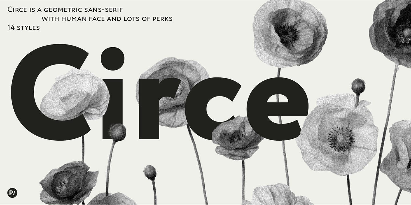
For body text I chose Circe
Paratype, 2018
A geometric sans-serif with humanist traits, designed specifically for Cyrillic. It combines Verdana’s simplicity with contemporary clarity.
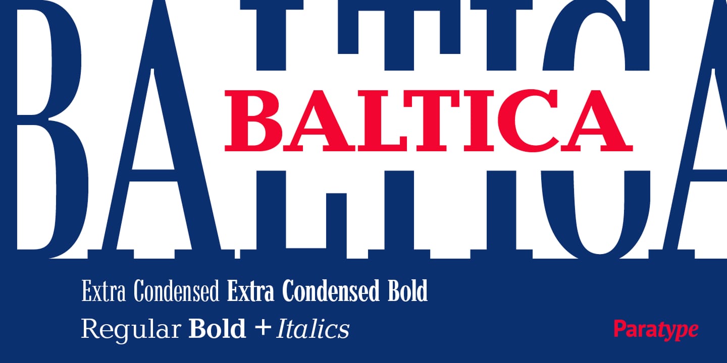
For headlines — Baltica
Polygraphmash, 1951
A transitional serif with strong readability and a confident tone. Its hybrid form bridges traditional serif qualities with modern slab-like geometry.
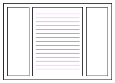
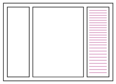
Typography isn’t just about typefaces — it’s also about scale.
Horizontal and vertical rhythm was structured through levels of emphasis:

Level 1: what the user was searching for.
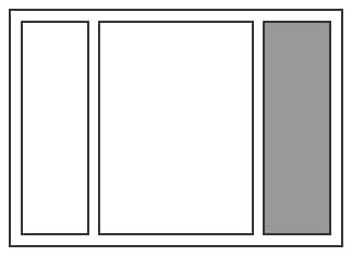
Level 2: contextually related content.

Level 3: additional, interesting content.

Level 4: extended or suggested materials.
Maintaining a consistent vertical rhythm is essential in news design, where multiple layers of text compete for attention.
Drawing on Robert Bringhurst’s The Elements of Typographic Style, I defined two typographic layers:
Primary content: 18px font size with 24px line height — the main reading flow.
Secondary content: 15px font size with 19px line height — inspired by Bringhurst’s guidance for marginalia and footnotes, lighter in weight yet connected to the whole.
This dual system separated the core story from supporting details while keeping a cohesive rhythm across the page.
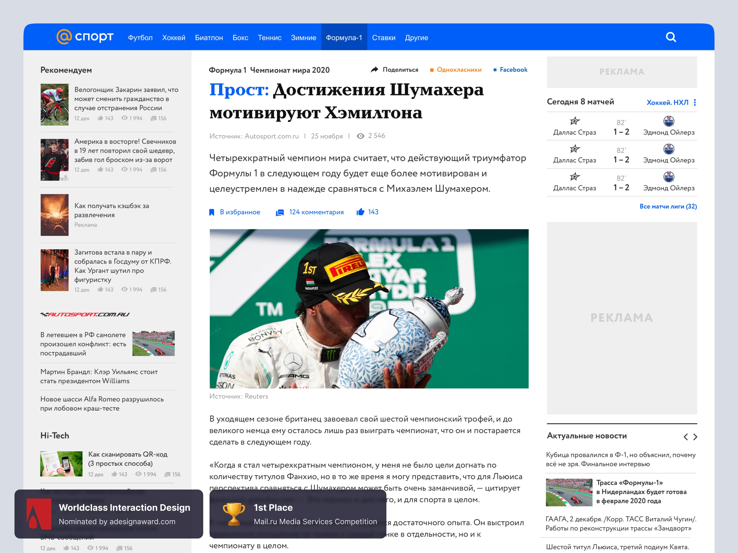
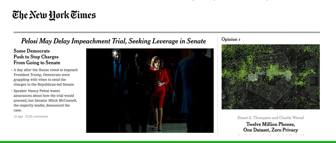
A news interface must remain visually balanced. I compared The New York Times (2018), where the grid holds equilibrium, with news.mail.ru of the same era, where composition collapsed toward the right side.
Insight: grid balance directly influences both trust and comfort in perception.


Continuous scrolling works as a cognitive hook — a kind of “mental chewing gum.”Since 2015, outlets like BuzzFeed and The Washington Post have used it to extend reading sessions.
For Mail.ru, I suggested scenarios with smooth transitions and progressive content loading.


The crowd effect remains a powerful psychological driver. This lowers decision friction: users are more likely to click content already validated by others.
Developed a typography-driven system for 14 Mail.ru media services.
Every design decision (typeface, proportion, grid, pattern) was backed by research and UX logic.
Demonstrated how typography shapes reading speed, trust, and engagement.
The concept received professional recognition and was nominated for the A’Design Award.


